
A punk poster wall can look expensive or it can look like you moved in last week. The difference is not whether the prints are rare. It’s whether the wall reads edited. Cheap walls feel random: mixed frame finishes, inconsistent spacing, glare you can see from across the room, and art floating above furniture with no reason.
This guide is about making the wall feel intentional while keeping the attitude. We’ll keep the content loud and the execution disciplined: a layout system, spacing rules you don’t improvise, and lighting that still works at night in warm, low mode.
The Wall Should Feel Like A Set, Not A Scrapbook
A good poster wall has a point of view you can explain in one sentence. That sentence becomes your edit filter. It can be an era, a city, a label, a photographer, or a visual language. The wall looks grown when every piece is answering the same question.
If you want the deeper framing logic, pair this with Punk & Rock Wall Art Display Strategies and treat this post as the layout and hardware playbook.
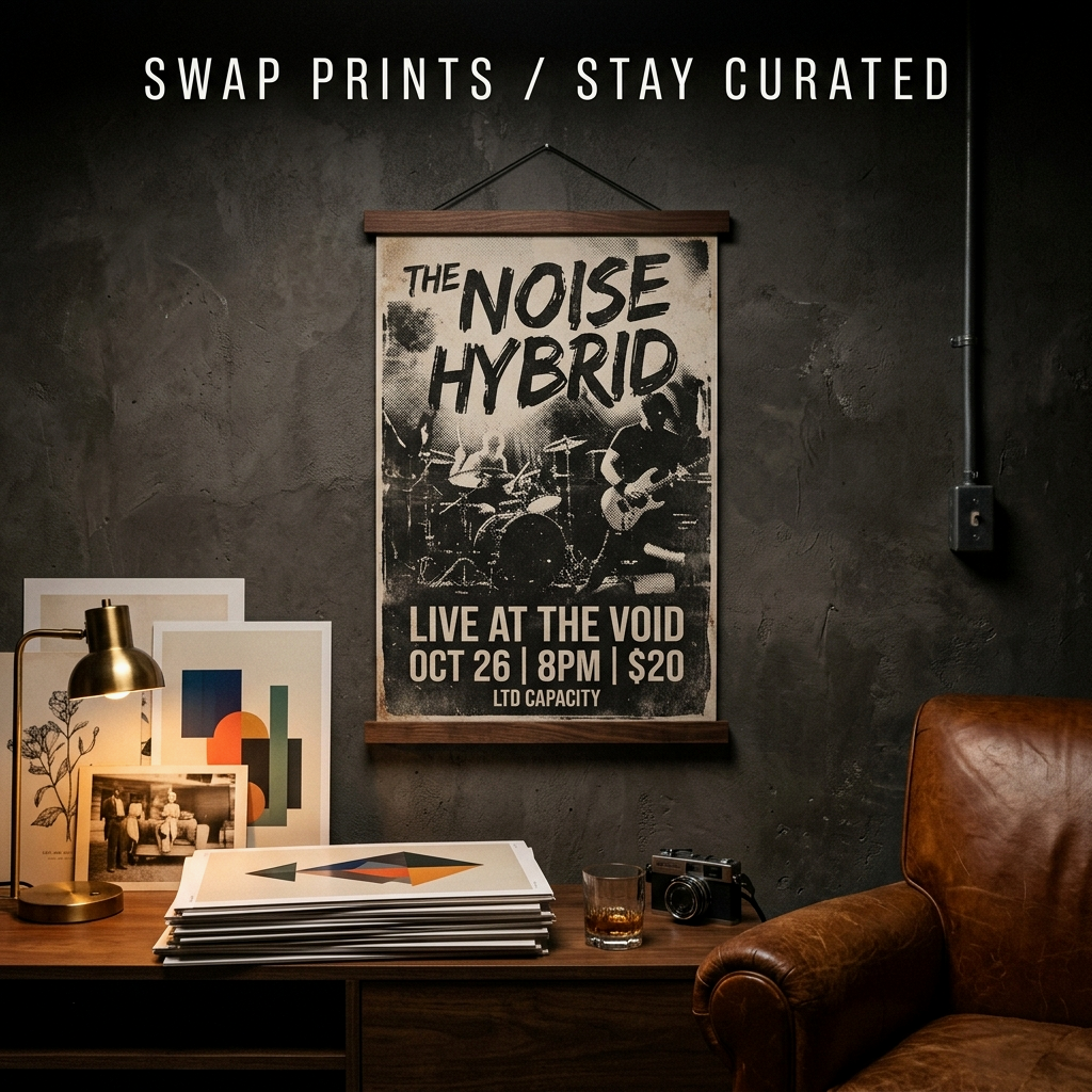
Pick Your Backdrop: Matte Black Frames, Dark Wood, Or No Frames
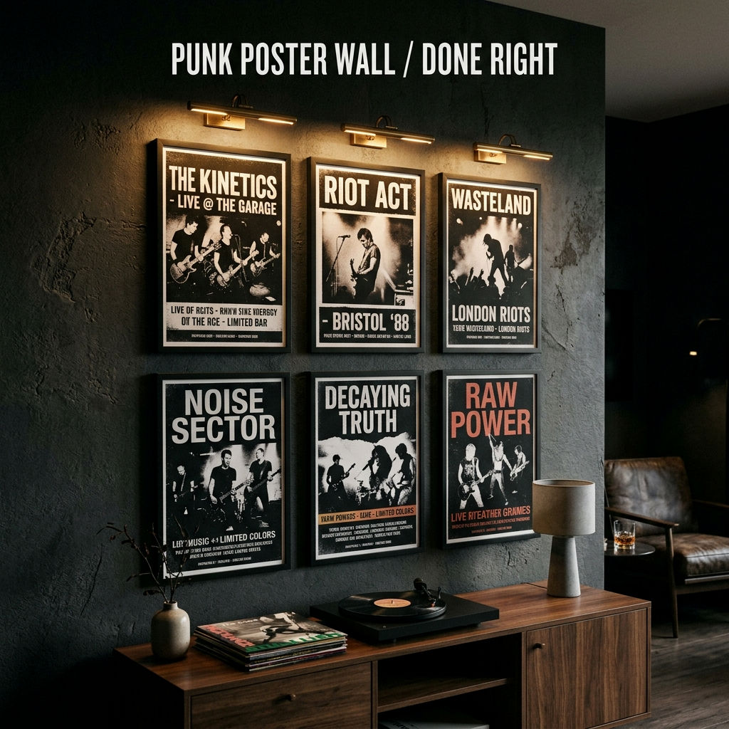
Most poster walls fail because the presentation is trying to compete with the print. For punk and rock graphics, the most reliable “adult” backbone is matte black. It disappears against dark walls and keeps the wall from turning into a thrift-store hallway.
- Matte black frames: best when you want the wall to read sharp and controlled.
- Dark wood poster hangers: best for lower-stakes prints you rotate often.
- No-frame mounting: only works when it’s very deliberate (and usually looks worse in a moody room).
One detail that reads instantly “adult”: a little breathing room. If you’re framing smaller prints inside larger frames, use a simple black or off-white mat so the wall feels intentional instead of cramped. And if a poster is even slightly valuable to you, look for acid-free backing (or add it yourself) so the paper doesn’t yellow against whatever cheap board came in the frame.
Size Rules That Make Posters Look Adult
Small pieces scattered around a big wall read accidental, especially in dark rooms where shadows reduce visual detail. You want at least one anchor size that carries the wall.
- Anchor print: a 24x36 (or similar) establishes scale fast.
- Support prints: 18x24 or 16x20 fill the grid without looking like filler.
- Micro pieces: flyers and handbills only work if they’re grouped, not sprinkled.
If you’re building a music corner, consider tying the wall to a record zone so the scale makes sense. Vinyl Record Display Ideas shows how to anchor the wall with furniture and gear.
Grid Or Controlled Chaos (Salon Wall)
There are two systems that actually work. Pick one. Mixing systems is how you get uneven spacing and that “I’ll fix it later” vibe.
- The grid: best when you have repeat sizes. Brutal, clean, modern.
- The controlled salon: mixed sizes, but with at least one shared alignment line (a top edge, bottom edge, or a single vertical spine).
For a salon wall, start with one hero piece and build outward. Keep the gaps consistent. If the geometry is disciplined, the prints can be as chaotic as you want.
Spacing: The Rule You Don’t Get To Improvise
Most walls look messy because the gaps are random. Pick one spacing rule and do not drift. Two inches is tight and gallery-like. Three inches reads a little looser. Either is fine. Changing it every row is what kills it.
A second rule: hang at a human height. A center line around 57–60 inches from the floor is a good target. Hanging everything high “to protect it” creates a dead zone of empty wall that makes the room feel unfinished.
Glass, Glare, And Why Night Lighting Matters
Dark rooms expose glare. Overhead lighting hits frame glass like a mirror and makes the entire wall look cheap. The fix is warm, directional light aimed across the wall instead of straight into it.
- Track heads or small spots, angled to graze the wall.
- A picture light over the hero piece (battery/rechargeable can work if you pick a warm setting).
- 2700K bulbs and a dimmer so the wall reads at night.
For the lighting plan in detail, use The Ultimate Guide to Dark Lighting Displays and treat the wall as a “zone” with its own light, not something the ceiling lamp accidentally covers.
How To Mix Flyers, Stubs, And Ephemera Without Clutter
The trick is grouping. One ticket stub on a wall looks like trash. A small cluster of ephemera in one frame looks like a collection. If you want the wall to feel curated, don’t scatter tiny pieces. Make them a single intentional unit.
- Use one frame for a mini-collage of stubs, flyers, and setlists.
- Keep the palette consistent (black/cream/red reads strong; full rainbow reads juvenile).
- Let one “quiet” piece sit next to one “loud” piece so the wall has rhythm.
What Makes Poster Walls Look Cheap (Fast)
- Mixed frame finishes with no reason.
- Inconsistent gaps, especially when the spacing changes every row.
- Everything hung too high, floating above furniture.
- One harsh ceiling light creating glare across the entire wall.
- Trying to fill the whole wall in one day with no layout plan.
Bottom line: the grown-up punk wall is real. Keep the prints raw, keep the layout disciplined, and light it like it matters.
Recommended Frames & Hardware
These picks match this guide: cleaner installs, straighter grids, and warm wall lighting that doesn’t bounce glare back at you. Links are affiliate links; pricing can change.

Rechargeable Picture Light (Warm + Dimmable)
A poster wall looks cheap when it only works in daylight. Look for warm/dimmable settings so the prints stay readable at night without harsh glare.

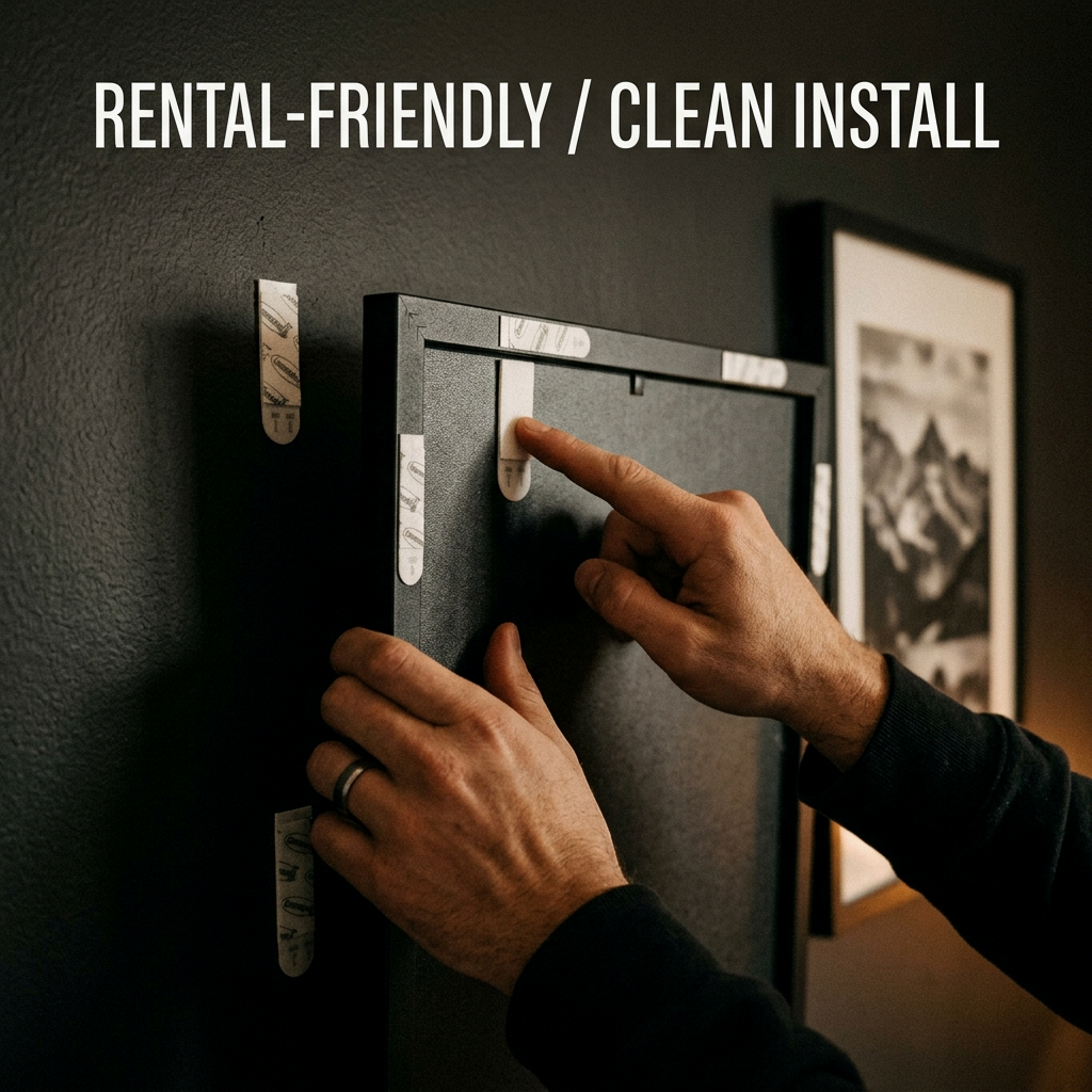
Picture Hanging Kit (Hooks + Nails Assortment)
The fastest way to keep spacing consistent is having the right hooks on hand. An assortment kit also helps you avoid improvising with whatever’s in a drawer.

Laser Level (For Straight Grids)
If you want the wall to read intentional, the lines matter. A basic self-leveling laser keeps grids clean and salon walls aligned to a real reference.

Armand Black
Founder & Lead Editor. Obsessed with high-contrast design.