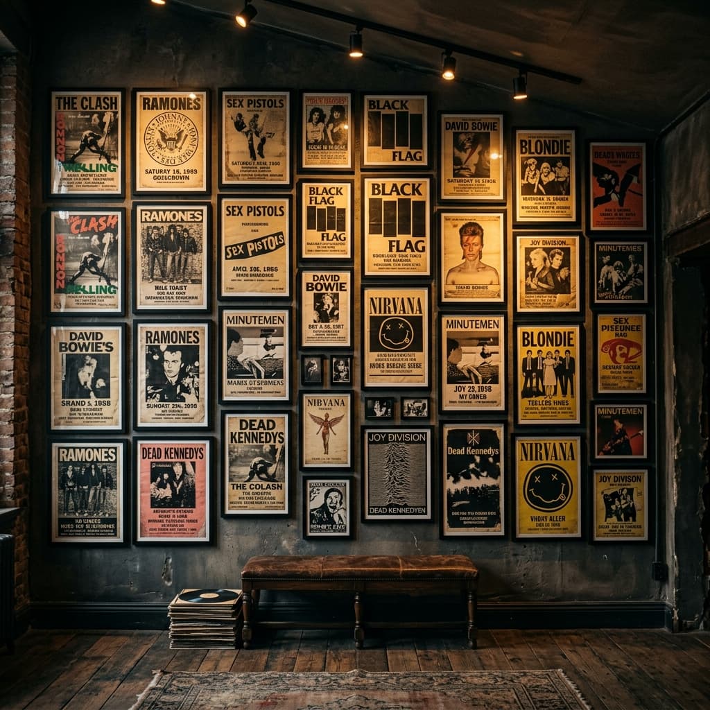
There is a specific kind of disappointment that happens when you finally hang the posters you love and the wall still looks… off. Not because the art is bad, but because the presentation reads temporary. Corners curl. Frames don’t line up. The whole thing feels like a storage solution, not a statement.
This is the difference between a wall that feels like a teenage bedroom and a wall that feels like a room with a point of view. The good news is you do not need a designer budget to fix it. You need a few rules, and the discipline to stick to them.
Here is how to build a punk and rock wall art display that looks sharp in daylight and still hits at night in low, warm light.
The One Rule: Pick The Story Before You Pick The Frames
A punk poster wall looks expensive when it has a narrative. It looks cheap when it is just “stuff I like” thrown together. Choose a story you can explain in one sentence:
- Show History: posters and ephemera from gigs you actually attended.
- Scene Focus: one city, one venue circuit, one label, one era.
- Graphic Language: a consistent palette or print style (screen-printed, photocopied flyers, bold typography).
When the story is clear, you can mix sizes and eras without it turning into visual noise.
What “Curated” Actually Means (And Why Spacing Matters)
Curated is not sterile. Curated is consistent decisions. On a wall, the biggest tell is spacing. Most messy walls are not messy because the art is wrong. They are messy because the gaps are random.
Use one spacing rule and do not improvise. Two inches to three inches between frames is the sweet spot for most rooms. Tighter reads more “gallery,” wider reads more “casual.” Pick one and commit.
Then place the wall at a human height. A good target is a center line around 57 to 60 inches from the floor. If you hang everything high to “protect it,” you end up with a dead zone of empty wall that makes the room feel unfinished.
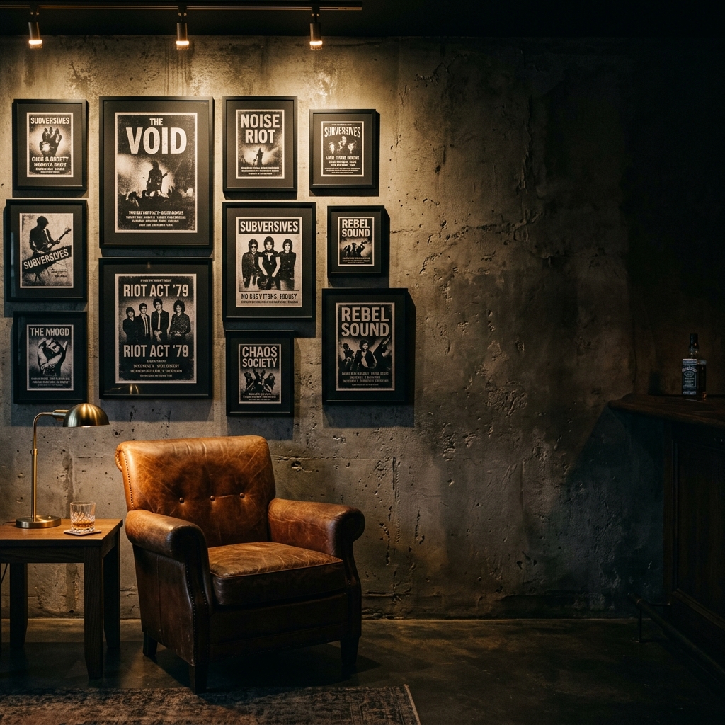
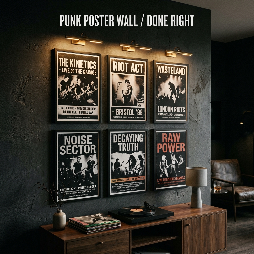
Grid Or Salon: Choose A Layout System
There are only two layout systems you need:
- The Grid: best for matching frame sizes (18x24, 24x36). Clean, brutal, modern.
- The Controlled Salon: best for mixed sizes, but with at least one shared alignment line (a common top edge, bottom edge, or one vertical spine).
If you do the salon approach, do it on purpose: anchor one hero piece, then build outward. Keep your spacing rule. Keep your edges disciplined. Chaos in the art is fine. Chaos in the geometry is what makes it look like a thrift store hallway.
Frames That Don’t Look Like An Afterthought
For punk and rock posters, your best “adult” look is usually matte black. Not glossy. Not ornate. Matte black aluminum feels modern and disappears so the print can do the talking. Dark-stained wood also works, especially if the room has leather, walnut, or warm metals.
Two practical choices that look good fast:
- Pack frames: commit to one finish and buy them in bulk so your wall has a backbone.
- Poster hangers: for lower-stakes prints, a dark wood hanger can look intentional and saves money.
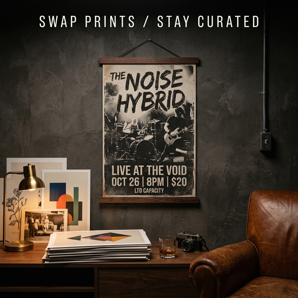
If a print matters to you, do not tape it directly to anything. Use proper backing and keep it out of direct sunlight. “Authentic wear” is one thing. Accidental damage is another.
Lighting Is The Difference At Night
If your room is moody, your wall needs its own lighting plan. Overhead lighting makes glazing glare and flattens the whole composition. Instead, use directional, warm light:
- Track lighting or small spotlights aimed across the wall (not straight at it).
- A picture light over the hero piece.
- A warm bulb and a dimmer so the wall reads at night.
If you want a deeper dive, pair this wall with the lighting approach in The Ultimate Guide to Dark Lighting Displays.
How To Style The “Stuff Around It”
Poster walls look better when the room supports them. You want the wall to feel like a zone, not a random collage floating above furniture.
- A low console or record cabinet under the wall.
- A small stack of books (architecture, music photography) to add weight.
- One warm metal element (muted brass, blackened steel) to break up the black.
- One plant, but keep it structural (dark planter, sharp silhouette).
If you are building a music corner, the cleanest companion piece is a vinyl setup. Start with The Definitive Guide to Vinyl Record Display Ideas and treat the wall like the stage backdrop.
The Mistakes That Make It Look Cheap
- Random frame finishes mixed together with no reason.
- Uneven spacing (especially when the gaps change every row).
- Hanging too high to “be safe.”
- Using one harsh ceiling light and calling it done.
- Trying to fill the entire wall in one weekend.
Leave breathing room. Negative space is what makes a wall feel curated instead of crowded.
Quick Build: A Realistic Weekend Plan
- Pick the story and select 8 to 12 pieces.
- Choose one frame finish and one spacing rule.
- Lay it out on the floor, then tape a paper template on the wall.
- Hang the hero piece first, then build outward.
- Light it with one warm, directional source.
Bottom line: punk wall art should feel raw in content and disciplined in execution. Keep the attitude, lose the mess.
Recommended Frames & Hardware
These picks match the framing approach in this guide. Links are affiliate links; pricing can change.

Matte Black Poster Frames (24x36)
A clean matte-black profile that disappears on dark walls, ideal for grid walls and hero pieces.

Black Magnetic Poster Hanger (Dark Wood)
Best for flyers and quick rotations when you want the wall to stay intentional without full frames.

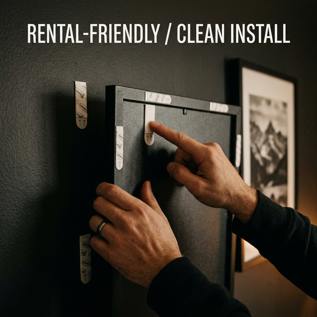
Damage-Free Hanging Strips (Large Frames)
Rental-friendly mounting for frames while you refine spacing and layout without extra wall damage.

Armand Black
Founder & Lead Editor. Obsessed with high-contrast design.