Most “masculine wall art” advice falls into two bad categories: generic hotel-room filler or try-hard clichés pretending to be attitude. Neither one gives a room a point of view. The better goal is simpler: art that feels considered, a little sharp, and visually heavy enough to hold a dark room together.
Dark wall art works when three things are true at the same time: the scale is right, the presentation is disciplined, and the mood is clear enough that every piece feels like it belongs to the same conversation. You can mix gothic paintings, punk posters, noir photography, and brutalist graphics if the wall still feels edited rather than crowded.
Pick A Mood, Not A Theme
Theme is what leads to neon signs, joke quotes, and random “edgy” prints all fighting each other. Mood is what creates cohesion. Before you buy anything, decide what kind of darkness you actually want the room to speak in.
A noir-leaning room wants monochrome photography, restraint, and a lot of negative space. A gothic room can handle drama, portraiture, older painting references, and more shadow. A punk-leaning room can take louder graphics, but the framing still needs discipline. A brutalist room usually works best when the art is graphic, stark, and not overly sentimental.
The point is not to lock yourself into one narrow lane. The point is to make sure every piece is answering the same question.
Scale Is Usually The First Thing People Get Wrong
Small art scattered around a wall almost always reads accidental. Dark rooms need stronger silhouettes because the shadows reduce visual information. That means one anchor piece often does more work than four medium prints trying to share the same wall.
As a practical starting point, think in anchor sizes like 24x36 or larger for the main piece, then build around it only if the wall actually needs support. A single large print over a console or record cabinet can look more expensive than a crowded cluster of smaller works that never settles.
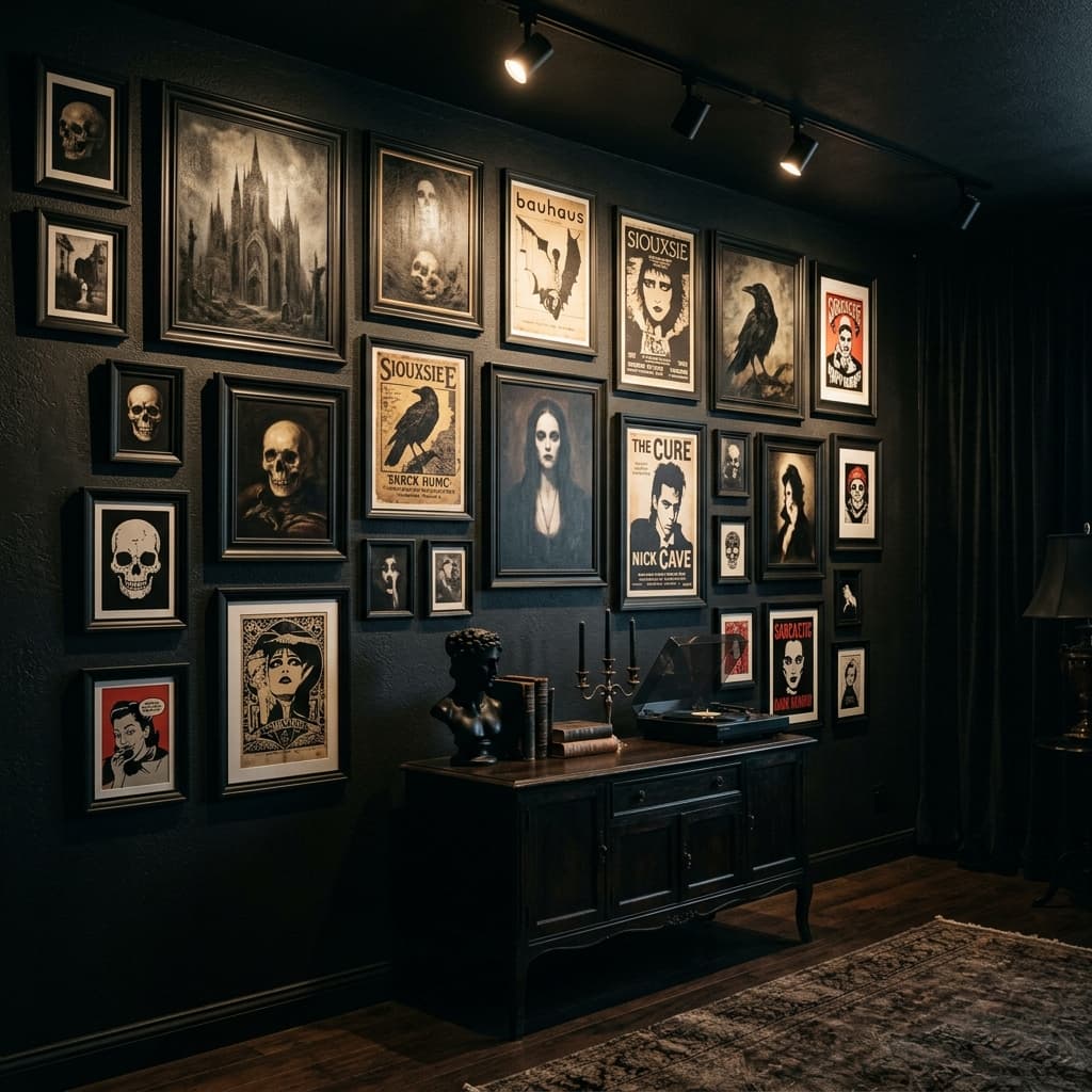
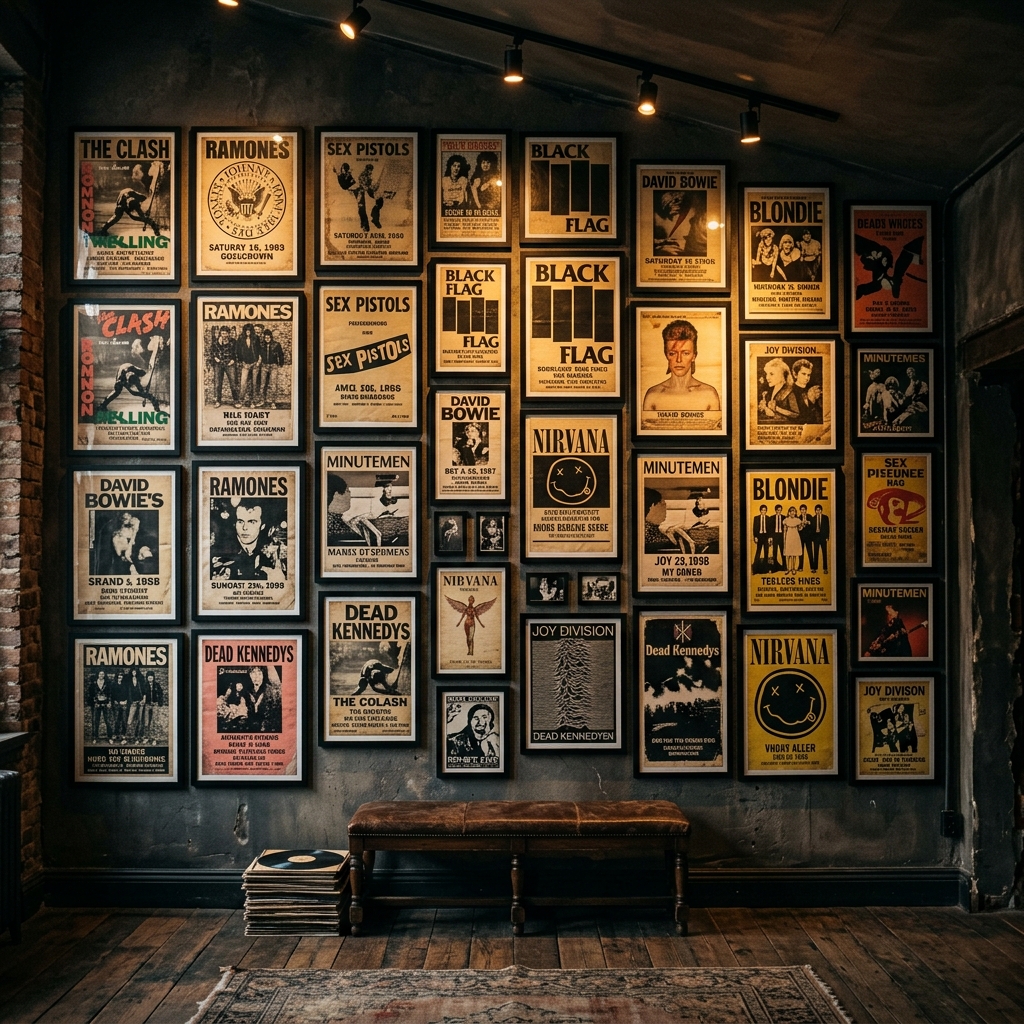
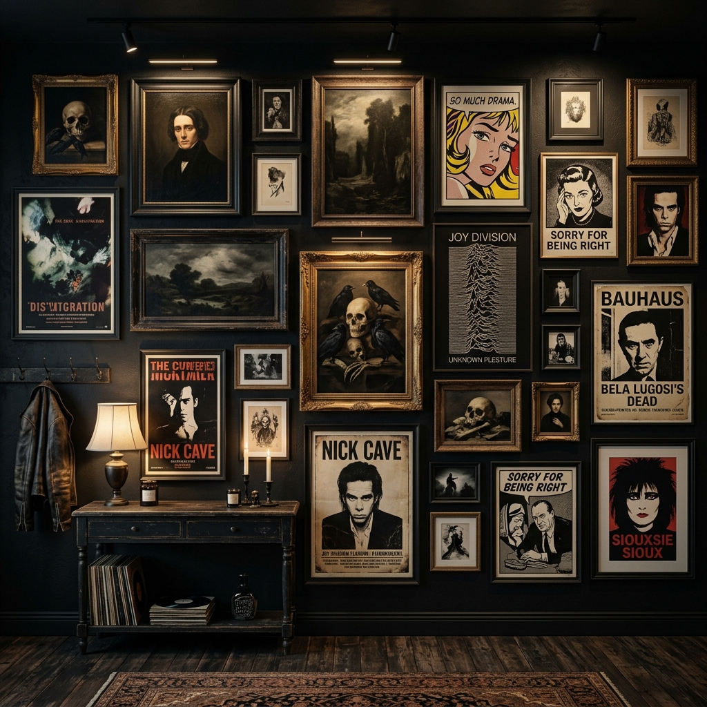
The Adult Poster Wall Is Real, But It Has Rules
Poster walls can look excellent in grown-up rooms. They just cannot look improvised. The posters can stay raw, loud, weird, sarcastic, or confrontational. The geometry cannot. Use one frame finish, keep the spacing consistent, and treat the wall like a gallery instead of a scrapbook.
If that is the direction you want, Punk & Rock Wall Art Display Strategies is the fuller playbook. The short version is this: chaos in the art is fine. Chaos in the spacing is what makes it look cheap.
Choose Art With Real Edge, Not Retail “Edginess”
Dark wall art does not have to mean skulls on everything. In fact, that is usually where rooms start feeling adolescent. Better categories are the ones that already carry tension on their own: gothic portraiture, bleak landscapes, strange surreal prints, black-and-white photography, sarcastic typography used sparingly, darker pop graphics, and movie-poster-style compositions that still feel designed.
The test is simple: would the piece still be interesting if the room were quiet? If the art only works because it is shouting, it usually won’t age well in a home.
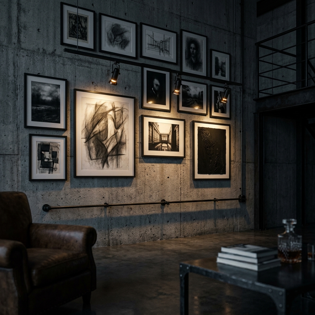
Texture Matters More Than Color In Dark Rooms
Low light flattens loud color fast. Texture survives longer. Matte paper, grainy photography, rough canvas, black-on-black surfaces, heavy ink coverage, and deep frame profiles all do more for a dark wall than an extra accent color will.
This is why a limited palette often feels richer. Black, charcoal, off-white, tobacco, muted brass. Let the visual depth come from the material finish instead of trying to solve the wall with more colors.
Frame Like You Mean It
Frames are not an afterthought in this style. They are half the wall. Matte black is the safest move because it disappears into dark paint and lets the art hold the attention. Very dark wood can work too, especially if the room already has walnut or ash in it. What usually fails is mixing finishes casually: one brass, one black, one light oak, one no-frame canvas, one acrylic float, all on the same wall.
If you break the frame rules, do it on purpose and only once.
Lighting Is What Makes The Wall Hit At Night
A good wall can still die under bad lighting. Overhead white light flattens frames, creates glare, and makes darker art look dead. If you want the wall to feel like part of a lounge rather than a hallway, use warm directional light around 2700K and aim it across the wall instead of straight into it.
If the room still needs a lighting plan, pair this with The Ultimate Guide to Dark Lighting Displays. Wall art only feels expensive after dark when the light is doing real work.
Placement Should Feel Tied To The Furniture
Art floating alone on a giant wall almost always looks under-considered. Anchor it to something: a record cabinet, a console, a low bookcase, a bar cart, even the back line of a sofa. Centering around roughly 57 to 60 inches is still a useful rule, but the bigger idea is that the wall should feel connected to the room below it.
That relationship is what makes the art feel like part of the architecture instead of something pinned on after the fact.
What Usually Makes Dark Wall Art Look Cheap
- too many small pieces with no anchor
- random frame finishes with no visual logic
- hanging everything too high
- harsh overhead lighting and no warm directional light
- trying to fill every inch of wall immediately
Bottom line: dark wall art looks premium when the room has a clear mood and the presentation stays disciplined. Buy fewer pieces, scale them properly, frame them with intent, and let the lighting finish the job.
Recommended Wall Art Tools
These basics help dark wall art look intentional: consistent framing and clean hanging hardware.

Matte Black Poster Frames (24x36)
The backbone of a dark wall art setup. A consistent matte-black frame finish makes mixed art feel intentional.

Black Magnetic Poster Hanger (Dark Wood)
Best for flyers and quick rotations when you want the wall to stay intentional without full frames.

Damage-Free Hanging Strips (Large Frames)
Rental-friendly mounting for frames while you refine spacing and layout without extra wall damage.

Armand Black
Founder & Lead Editor. Obsessed with high-contrast design.